I need to arrange the given code to achieve a grid view as shown in the screenshot below:
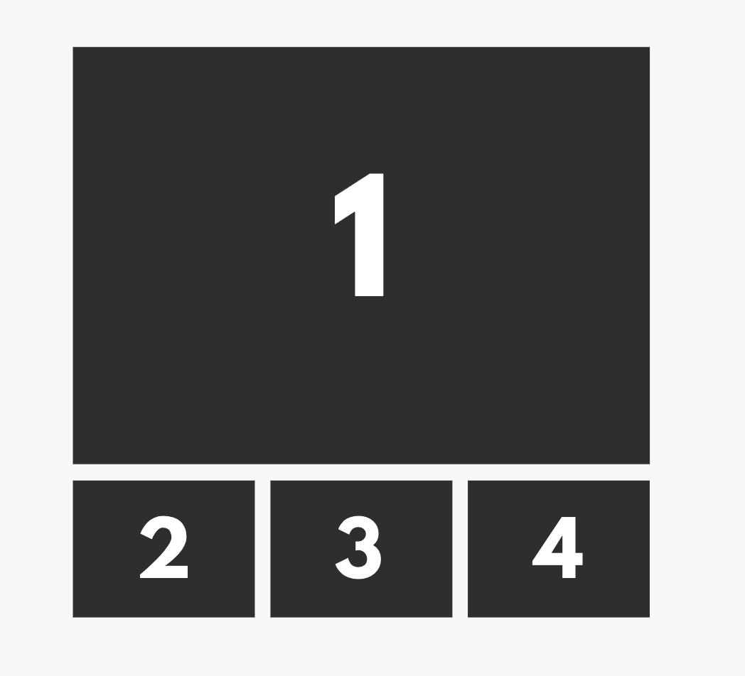
The first image in the row should be full width (100%), and the second row should contain three images of equal width.
DEMO: http://jsfiddle.net/gycmp21k/
Fenced code blocks:
body {
  padding: 40px;
}

* {
  margin: 0px;
  padding: 0px;
}

ul {
  list-style: none;
  display: grid;
  grid-template-columns: 2fr 1fr 1fr;
  grid-template-rows: 1fr 1fr;
  gap: 1rem;
}

li:first-child {
  grid-row: span 2;
}

img {
  display: block;
  width: 100%;
  height: 100%;
  object-fit: cover;
}
<ul>
  <li>
    <img src="https://via.placeholder.com/400" />
  </li>
  <li>
    <img src="https://via.placeholder.com/400" />
  </li>
  <li>
    <img src="https://via.placeholder.com/400" />
  </li>
  <li>
    <img src="https://via.placeholder.com/400" />
  </li>
</ul>