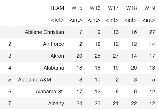
I’m trying to create a graph using ggplot2 that displays the columns W15, W16, W17, W18, W19 grouped by the TEAM column on the y-axis and the years 2015-2019 on the x-axis.
Here’s the code you can use to create the graph you described:
library(ggplot2)

ggplot(data = dt, aes(x = YEAR, y = TEAM)) +
  geom_point(aes(size = W15), color = "red") +
  geom_point(aes(size = W16), color = "blue") +
  geom_point(aes(size = W17), color = "green") +
  geom_point(aes(size = W18), color = "purple") +
  geom_point(aes(size = W19), color = "orange") +
  scale_size_continuous(range = c(1, 10)) +
  labs(title = "Wins by Team and Year",
       x = "Year",
       y = "Team") +
  theme_minimal()
This code creates a scatter plot with each team represented by a point on the y-axis and the years 2015-2019 on the x-axis. The size aesthetic is used to represent the number of wins for each team and year combination. The scale_size_continuous function is used to adjust the size of the points. Finally, labs is used to add a title and axis labels, and theme_minimal is used to create a clean, simple design.